
Importance Sampling
한마디 요약: target 분포로 부터 샘플을 구하기 어려울 때, proposal 분포의 샘플에 importance weight을 곱하여 구하는 방법이다.
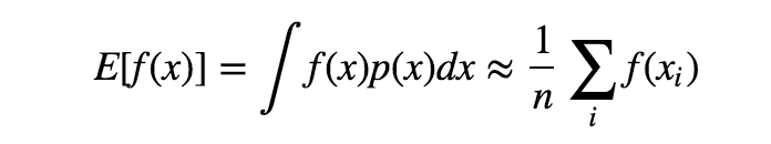
좀 더 자세히 말하면, target 분포 $p(x)$에서의 표본을 사용해서 $f(x)$의 평균을 얻고자할 때 사용된다.
표본을 얻기 쉬운 proposal 분포 $q(x)$ 와 importance weight $\frac{p(x)}{q(x)}$ 를 사용하여 아래와 같이 구할 수 있다.
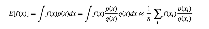
그런데 위의 식에서 문제점은 $q(x)$ 가 $0$ 이 되거나 $q(x)$의 분산이 크면 추정값에 대한 정확도가 떨어진다.
1
2
3
import numpy as np
import matplotlib.pyplot as plt
from scipy import stats
구현
예제는 이곳을 참조하였다. \(f(x) = \frac{1}{1 + e^{-x}}\)

이 article의 내용을 인용.
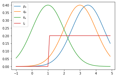
For simplicity reasons, here both $p(x)$ and $q(x)$ are normal distribution, you can try to define some $p(x)$ that is very hard to sample from. In our first demonstration, let’s set two distributions close to each other with similar mean($3$ and $3.5$) and same sigma $1$.
추가적으로 proposal 함수로 사용할 $k_x$ 와 $l_x$ 도 다음과 같이 정의.
1
2
3
4
5
6
7
8
9
10
11
12
13
14
15
16
17
18
def f_x(x):
    return 1/(1 + np.exp(-x))


# pre-setting
mu_target = 3.5
sigma_target = 1

mu_proposal1 = 3
sigma_proposal1 = 1

mu_proposal2 = 1
sigma_proposal2 = 1

p_x = stats.norm(mu_target, sigma_target)
q_x = stats.norm(mu_proposal1, sigma_proposal1)
k_x = stats.norm(mu_proposal2, sigma_proposal2)
l_x = stats.uniform(1, 5)
1
2
3
4
5
6
7
x = np.arange(-1,5,0.1)
plt.plot(x, p_x.pdf(x), label='$p_x$')
plt.plot(x, q_x.pdf(x), label='$q_x$')
plt.plot(x, k_x.pdf(x), label='$k_x$')
plt.plot(x, l_x.pdf(x), label='$l_x$')
plt.legend()
plt.show()
1
2
3
4
5
6
7
8
9
10
11
12
13
14
15
16
17
18
19
20
21
22
23
24
25
26
27
28
29
30
31
32
33
34
35
36
37
38
39
40
41
42
43
44
45
46
47
48
# target 분포의 샘플: 구하기 어려운 샘플이라고 가정.
s = 0
n = 1000
for i in range(n):
    # draw a sample
    x_i = np.random.normal(mu_target, sigma_target)
    s += f_x(x_i)
print("true value(sampled mean)", s/n)

# q_x 를 이용한 샘플링.
n_estimation = 10
history = []
for j in range(n_estimation):
    s = 0
    for i in range(n):
        # draw a sample
        x_i = np.random.normal(mu_proposal1, sigma_proposal1)
        value = f_x(x_i)*(p_x.pdf(x_i) / q_x.pdf(x_i))
        s += value
    history.append(s/n)
history = np.array(history)
print("estimated value1 : (mean, std) = ({:.2f}, {:.2f})".format(history.mean(), history.std()))

# k_x 를 이용한 샘플링.
history = []
for j in range(n_estimation):
    s = 0
    for i in range(n):
        # draw a sample
        x_i = np.random.normal(mu_proposal2, sigma_proposal2)
        value = f_x(x_i)*(p_x.pdf(x_i) / k_x.pdf(x_i))
        s += value
    history.append(s/n)
history = np.array(history)
print("estimated value2 : (mean, std) = ({:.2f}, {:.2f})".format(history.mean(), history.std()))

# q_x 를 이용한 샘플링.
history = []
for j in range(n_estimation):
    s = 0
    for i in range(n):
        # draw a sample
        x_i = np.random.uniform(1, 6)
        value = f_x(x_i)*(p_x.pdf(x_i) / l_x.pdf(x_i))
        s += value
    history.append(s/n)
history = np.array(history)
print("estimated value3 : (mean, std) = ({:.2f}, {:.2f})".format(history.mean(), history.std()))
1
2
3
4
5
true value(sampled mean) 0.9547997027431232
estimated value1 : (mean, std) = (0.95, 0.01)
estimated value2 : (mean, std) = (0.97, 0.33)
estimated value3 : (mean, std) = (0.95, 0.02)
결과를 보면 $p_x$ 와 형태가 비슷한 norm 분포인 $q_x$와 $k_x$ 를 보았을때,
평균점이 가까울 수록 true value와의 오차가 적었고, 분산도 적었다.
하지만, 주목해서 봐야할 점이 있다.
norm 분포인 $k_x$ 를 보면 평균점이 멀어짐에 따라 분산 값이 크게 증가하며,
단순한 uniform 분포인 $l_x$ 가 오히려 더 좋은 결과를 이끌어 냈다는 점이다.
고찰
target 분포와 비슷하면 true value와 추정값이 비슷하고 분산도 낮지만 분포가 많이 달라지면 값이 많이 다르고 분산도 크게 증가한다. target 분포의 형태를 모른다면 차라리 proposal 분포를 범위를 넓게 uniform 분포로 하는 편이 좋다.
Future Work
-
이론적으로 더 공부해 보고싶을 경우 Standford Lecture Note를 따라가보는 것도 좋을 것 같다.
-
Importance Sampling을 활용하는 Application을 공부해 보는 것도 좋을 것 같다.
- 최근 추천 분야에 이런 논문도 개제 됨: Personalized Ranking with Importance Sampling, WWW 2020

Leave a comment